Where she was
Cassie is a women's health naturopath, nutritionist and researcher. Hormones, gut health, fertility, kids' health. A podcast. A cookbook. Years of clinical depth and the kind of reputation people drive across the city for.
Her brand didn't show any of it.
Dated, disconnected, spread across tools that didn't talk to each other. The depth was all there. None of it was visible.
We started with the hard questions
Before a single design file was opened, we sat down and let Cassie talk. Not "what are your brand colours." Questions that go sideways at who she really is, who she's for, what she'd never want to become.
Some made her stop and sit with something she'd been circling for years but never said out loud.
What came out was the real thing. She's for the woman told her results are within range who knows she doesn't feel right. The one who wants someone to say it's not in your head, I see you. Health decoded.
That is the brand. Everything after came from here.
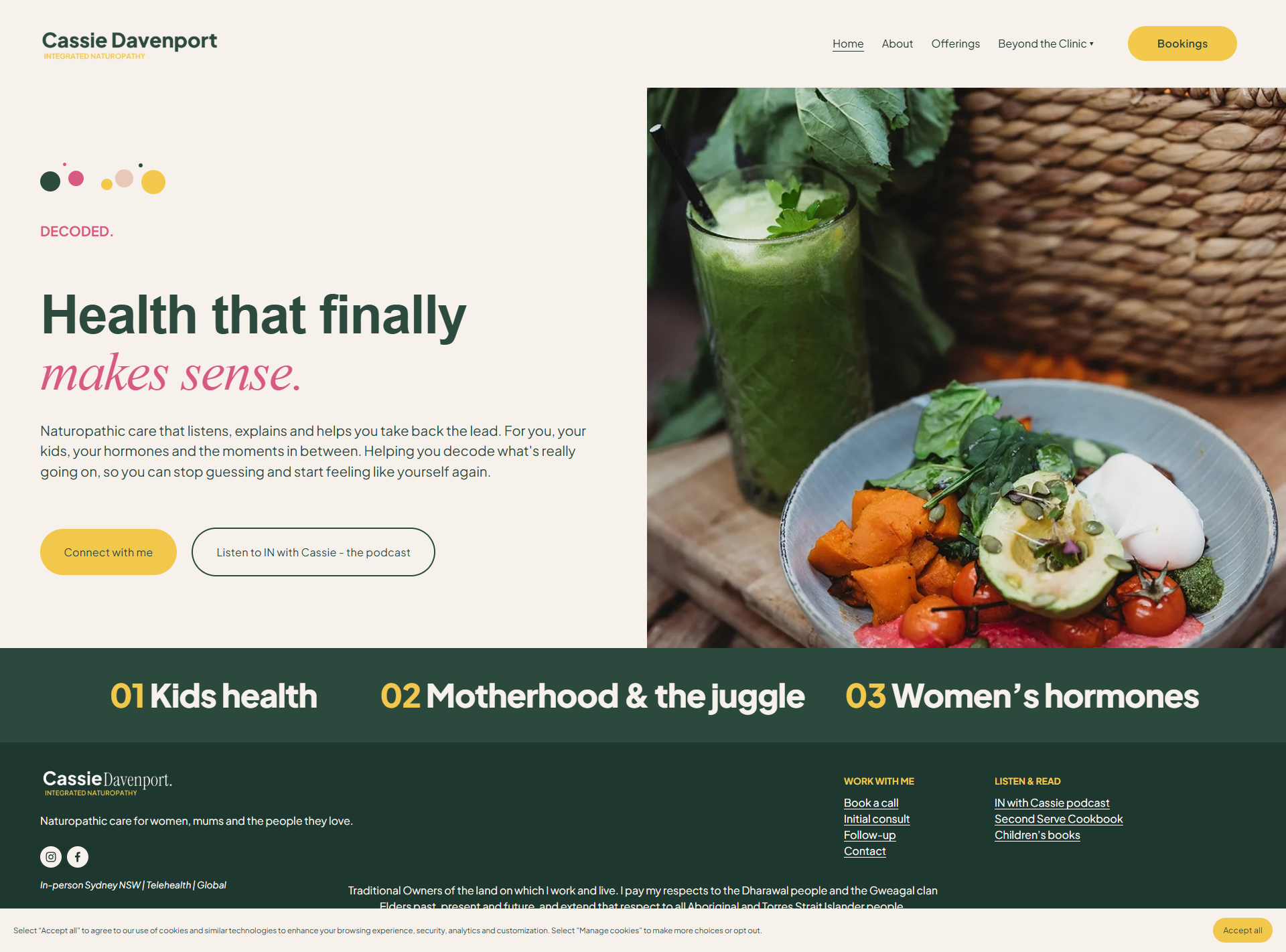
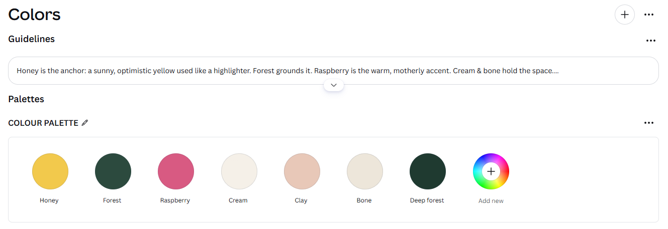
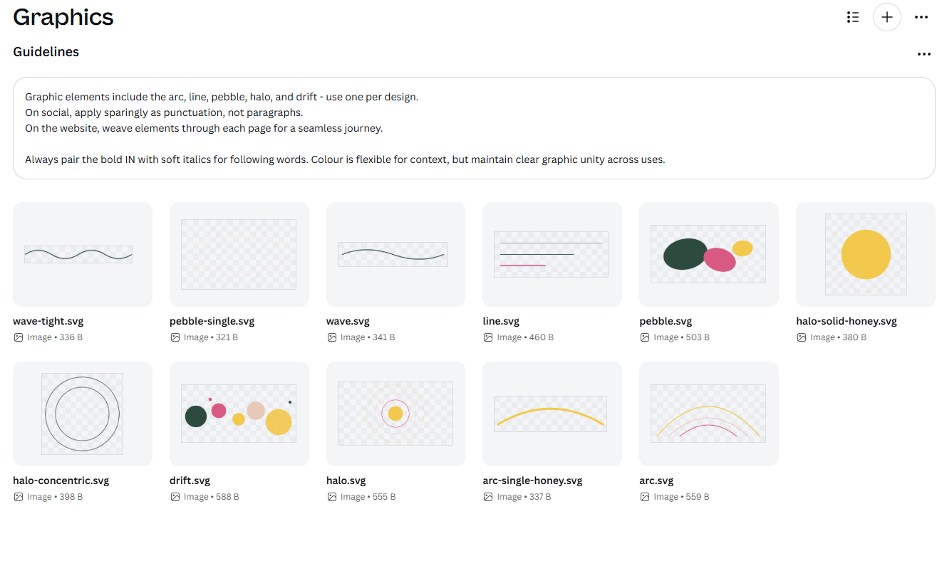
The identity
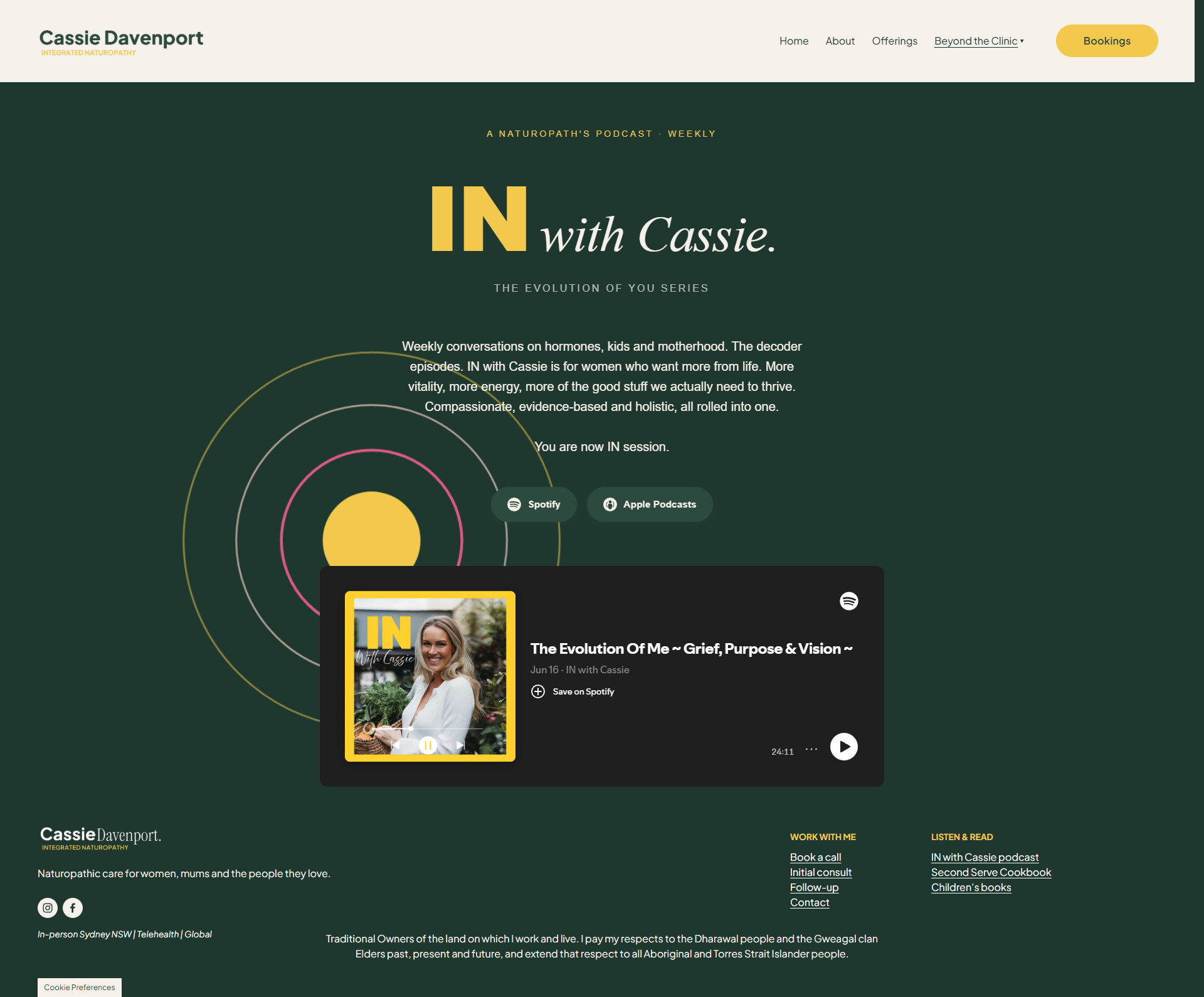
Warm, grounded, premium without being clinical. A typographic system pairing Plus Jakarta Sans with Instrument Serif italic. A seven-colour palette. The CD wordmark. An IN campaign device that runs as a connective thread across everything she does.
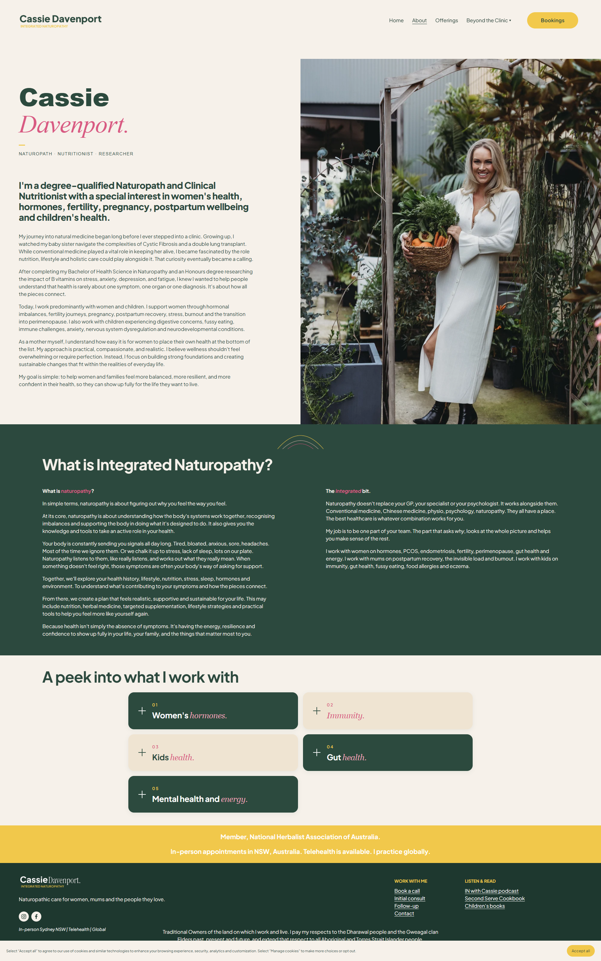
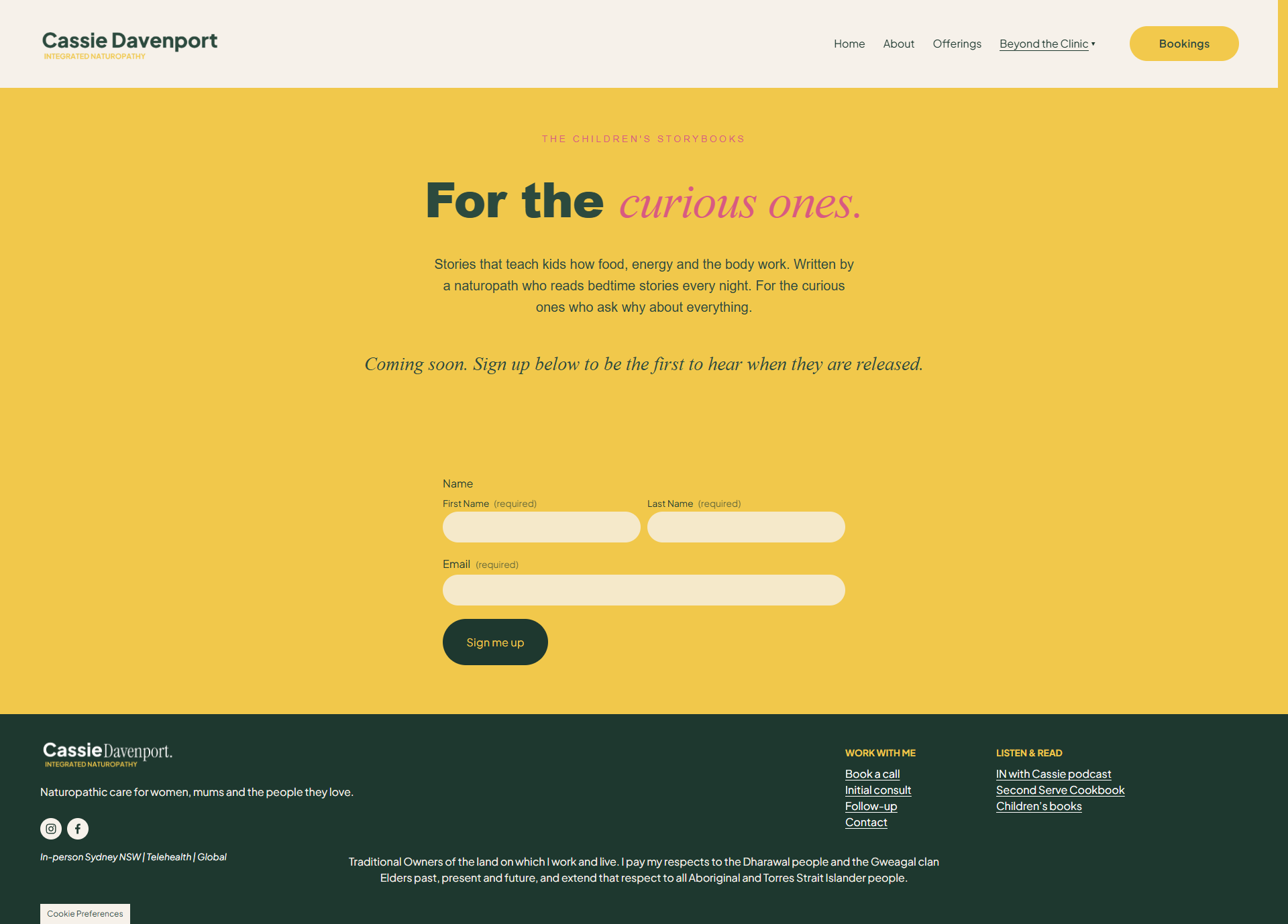
The website
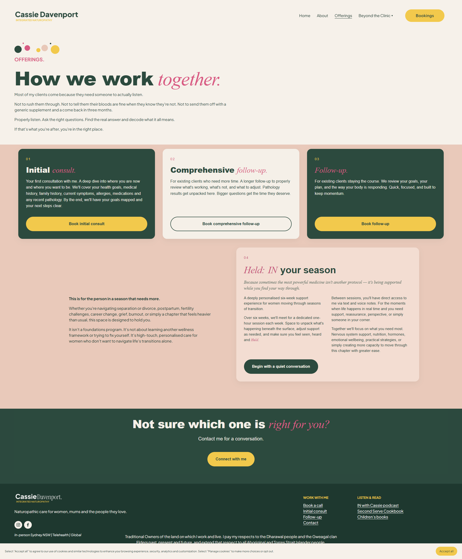
A custom Squarespace site, mobile-first and written in her voice. Where the standard templates fell short, I coded custom pieces by hand so nothing looked off-brand or generic.
Each part of her practice is colour-coded so what she treats is easy to scan. Her six-week support program has its own softer visual treatment to match its gentler tone. Small signature moments run through the whole site, down to a warm "you're in" when someone joins the children's book waitlist.
The same brand, everywhere
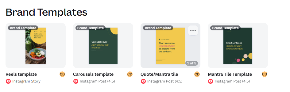
The identity carried into everything she touches. Her social media handles and bios. Her Google Business profile. A full set of Canva templates so she can make on-brand content herself, without needing me every time.
She left with a brand she owns and can run.
Fewer places to go
Her business used to live across disconnected tools. We pulled it together, cut what she was juggling and set up systems so the business runs without her holding every piece in her head.
Booking, waitlists and sign-up databases are built directly into the website so nothing lives in a separate tool. Brand templates across Canva, Word and PowerPoint mean every client-facing document starts on-brand. And a full review of her tool stack cut the platforms she was paying for and the admin that existed purely for its own sake.
Where she landed
One identity, consistent everywhere someone meets her. A website that works. A business with fewer moving parts and more room to breathe. A foundation ready for the podcast, the cookbook, the books and everything she's building toward.